Lundin Mining
We’re excited to welcome Lundin Mining as a new client and to partner with their...
Aya Gold & Silver
Aya Gold & Silver is a rapidly growing, Canadian-based silver producer with...
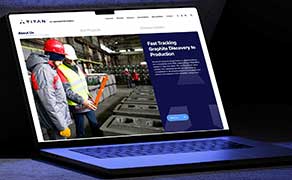
Titan Mining – A Streamlined Website That Reflects a Growing Company
As Titan Mining continued to evolve as a producing mining company, they needed a...