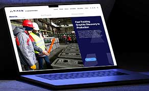
Titan Mining – A Streamlined Website That Reflects a Growing Company
As Titan Mining continued to evolve as a producing mining company, they needed a...
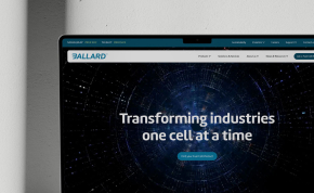
Developing Ballard.com - A Collaborative, User-Focused Web Project
Ballard Power Systems, a global leader in fuel cell technology, sought to revamp...
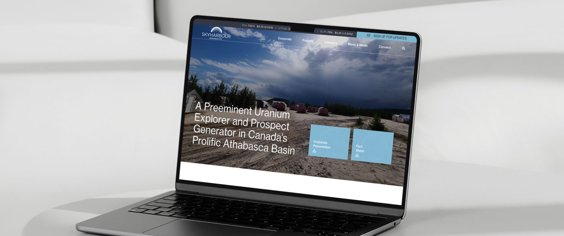
Skyharbour Case Study
Skyharbour is a prominent player in its industry, known for its diverse project...