Amerigo Resources - a forward-thinking company that produces sustainable copper materials from waste
The Company
Amerigo Resources, a forward-thinking company that produces sustainable copper materials from waste, approached BLENDER with a need for a bold, distinct design to convey its unique approach in a crowded market.

"We came to BLENDER with a wide slate of unique asks, and an interest in being distinct from our peers in the copper sector. The team delivered, producing a design that quickly gets our data across while being memorable and different from anything else out there."

Aurora Davidson
Chief Executive Officer
The Situation
Amerigo has been a client of BLENDER’s since nearly the beginning. But their old BLENDER-designed website was beginning to show its age, and the company was eager to move in a bold new design direction. They entrusted our team to build a creative new platform from the ground up.
The Solution
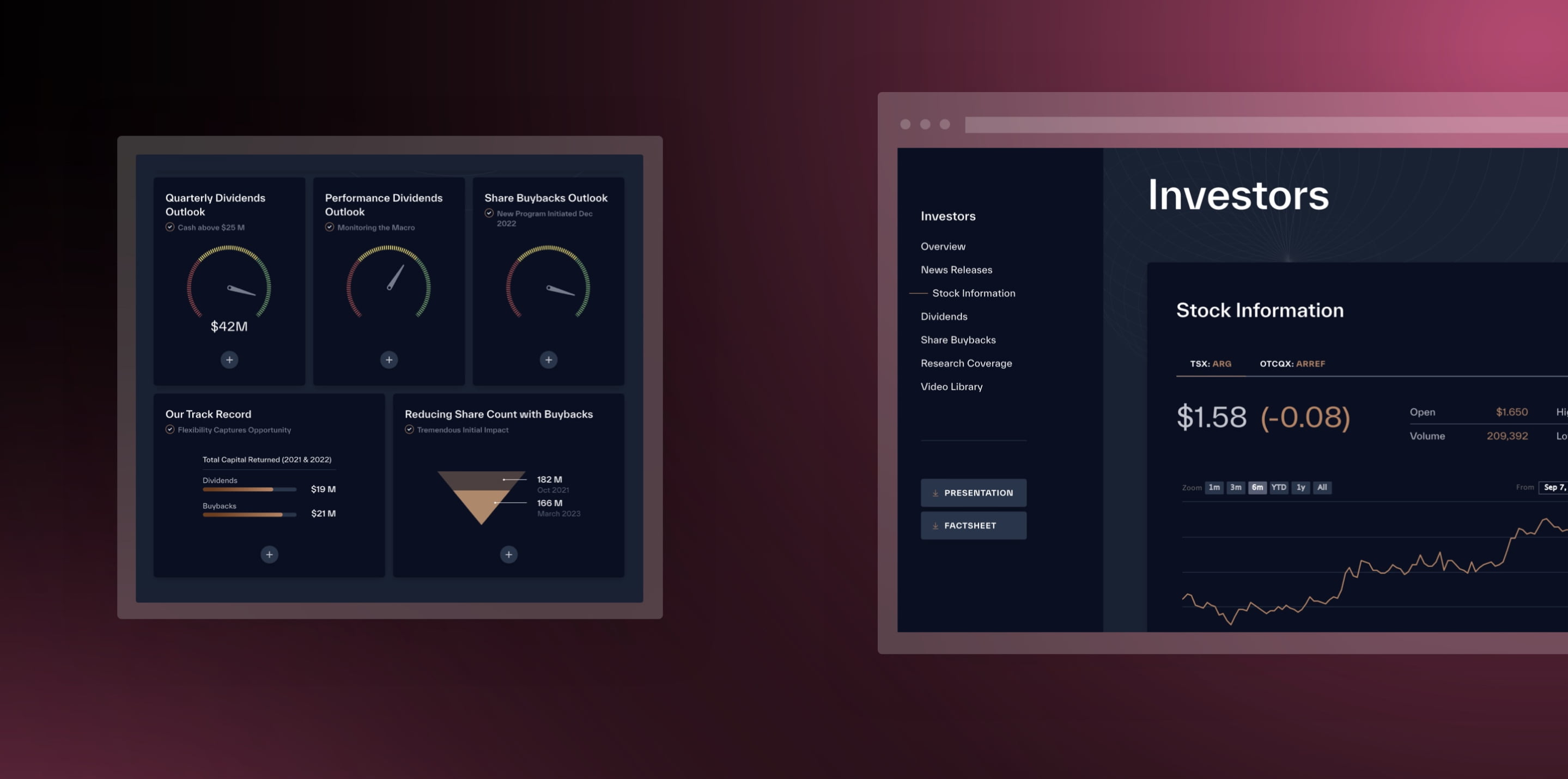
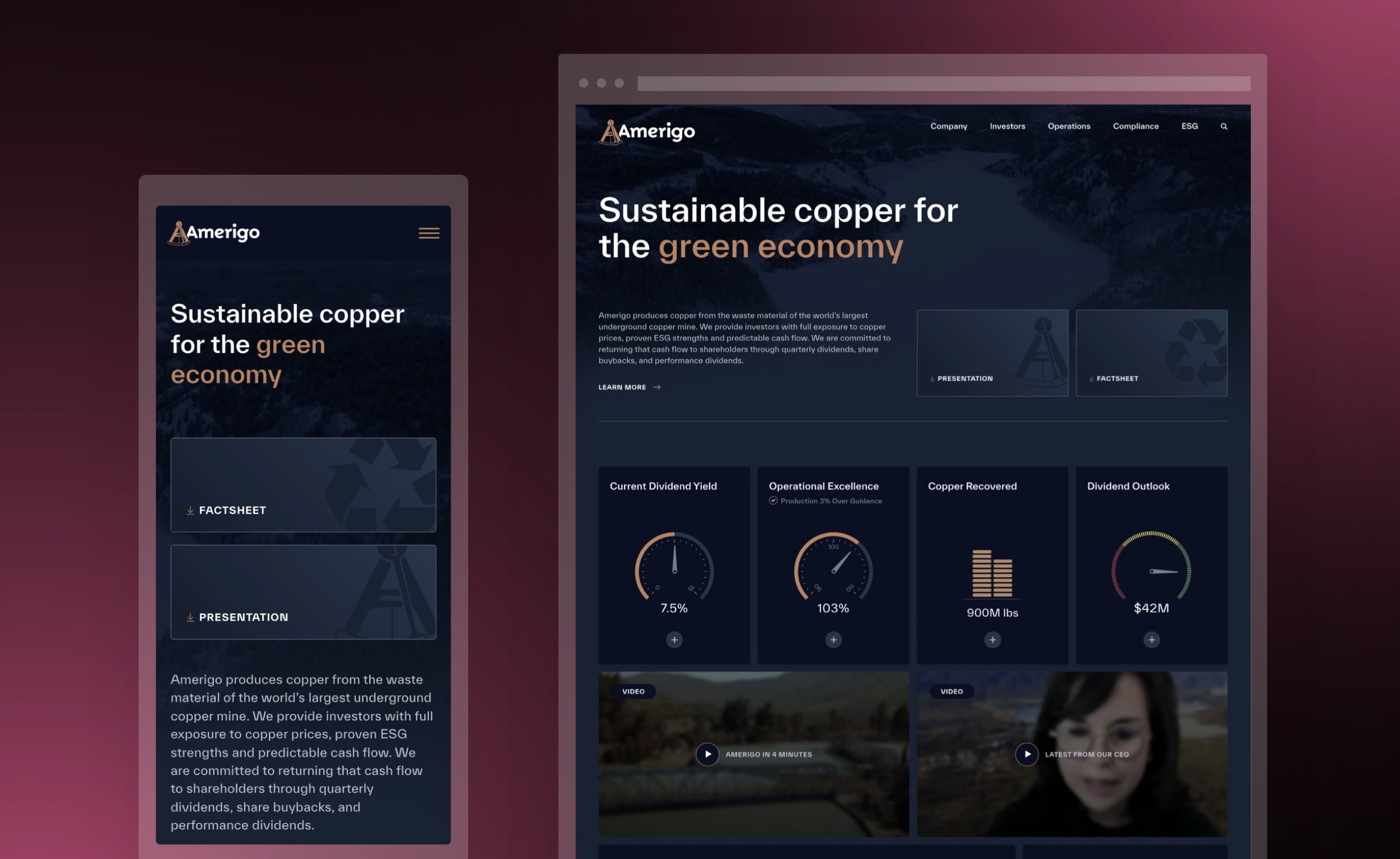
The BLENDER team took Amerigo’s design identity into new territory, with a new colour scheme, an array of interactive elements to keep the attention of curious investors and an innovative, up-to-the-minute design that truly stands out from the competition.
Highlights
- Gauges to visually convey dividend yields, production numbers, and other key metrics
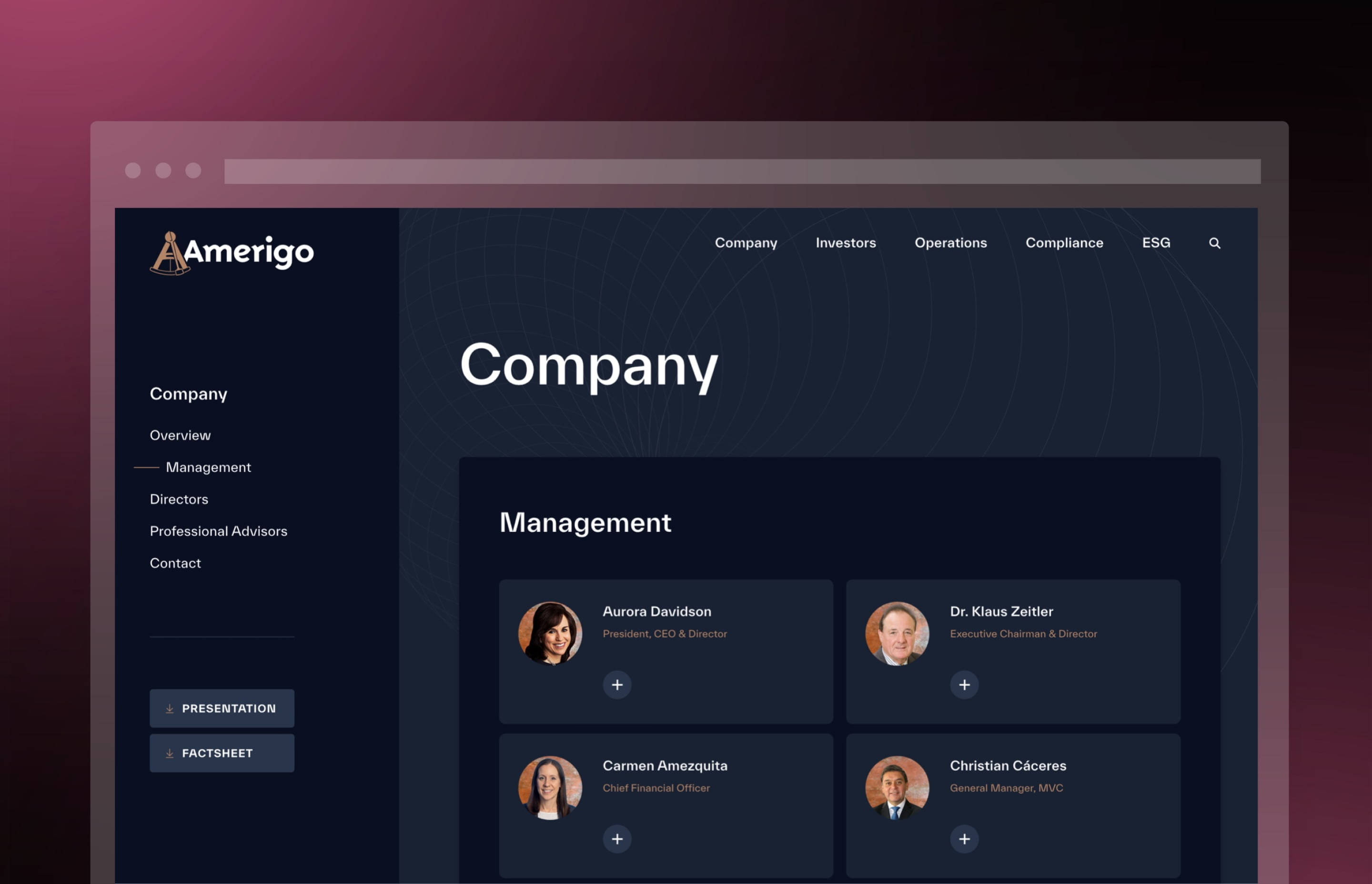
- A dark colour scheme with a truly one-of-a-kind layout that is still easy to navigate
- A unique design that still remained user-friendly
- An abundance of interactive elements that spur investor engagement
- Animated elements and dashboards to center what’s important
- Easy access to essential metrics, investor presentations, and factsheet
