The Company
Oberon Capital Corp.—a market leader at reducing the after-tax cost of philanthropy while providing Canada's natural resource sector with essential capital—tapped BLENDER to build a custom site with a more intuitive organizational structure, alongside a clearer and more appealing visual style.
What the Oberon team had to say...
"Oberon Capital needed a site that boiled down the complexity of our offerings in a simple, easily accessible way, while building trust in our company and our mission. Our new site accomplishes this and more, with an eye-catching design that makes everything our visitors need simple to find."

Tamara Brown
Partner, Head of Capital Markets
The Situation
Oberon Capital's old site lacked clarity, forcing investors to click around to find what they were looking for. It's visual style was also dry and underwhelming, lowering engagement.
The Solution
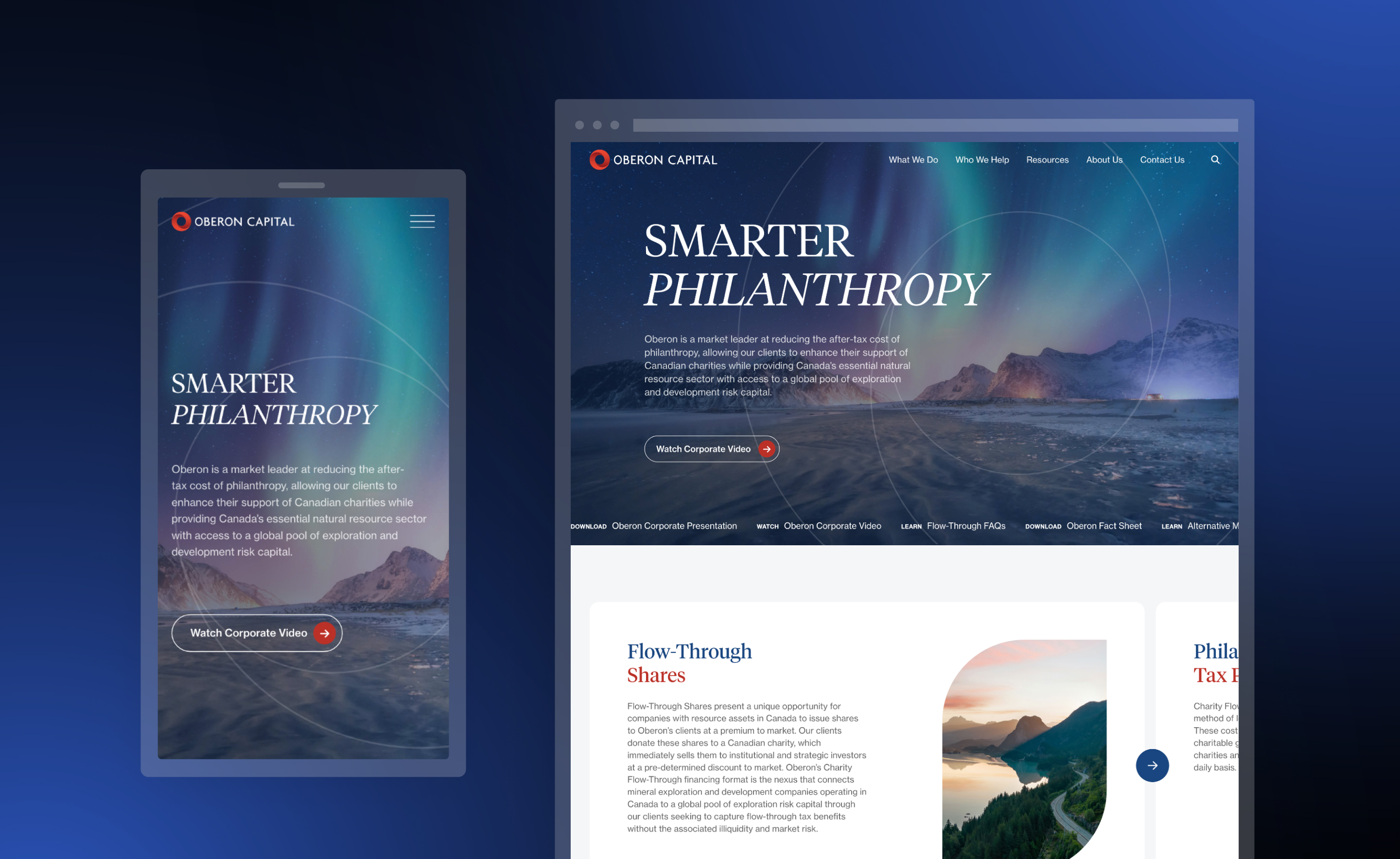
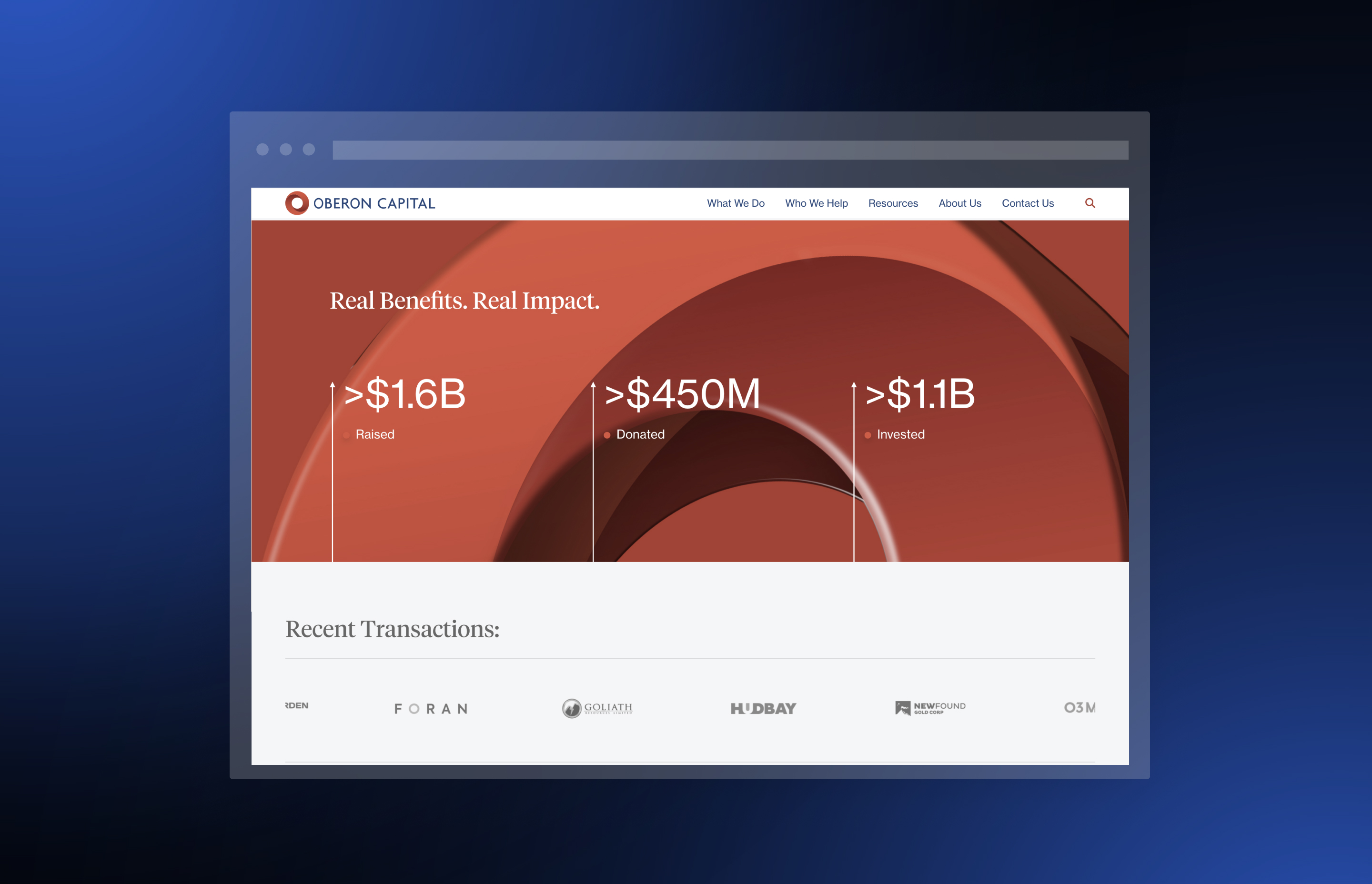
BLENDER overhauled Oberon's sitemap architecture and visual design, ensuring that everything investors might need is available quickly and easily. The new platform contains sections for every detail of the company's unique offerings, including additional informational documents that serve as an introduction into the space. The entire project is topped off by a dynamic homepage that packs a wealth of data into a single compelling package.
Highlights
-
Striking homepage that spotlights the company's primary corporate video
-
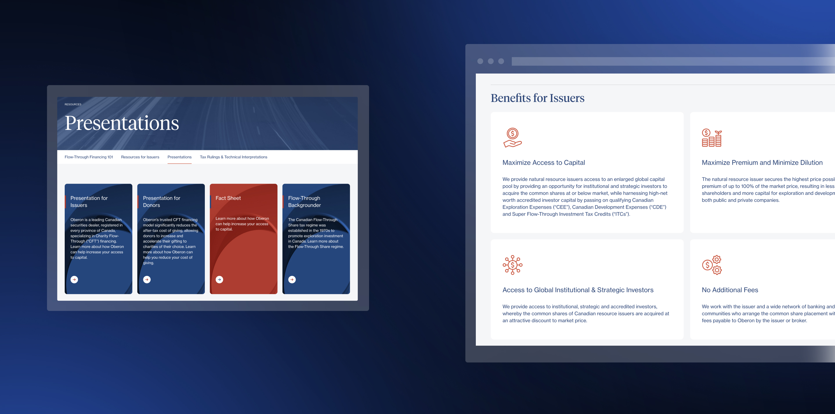
Information tabs that clarify each component of the company's offerings
-
A detailed breakdown of each segments the company serves
-
Resources page that dives deep on company specifics
