Whether you need a website, a comprehensive investor marketing campaign, or basic public company collateral, Blender provides a peerless solution.
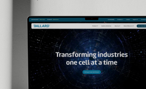
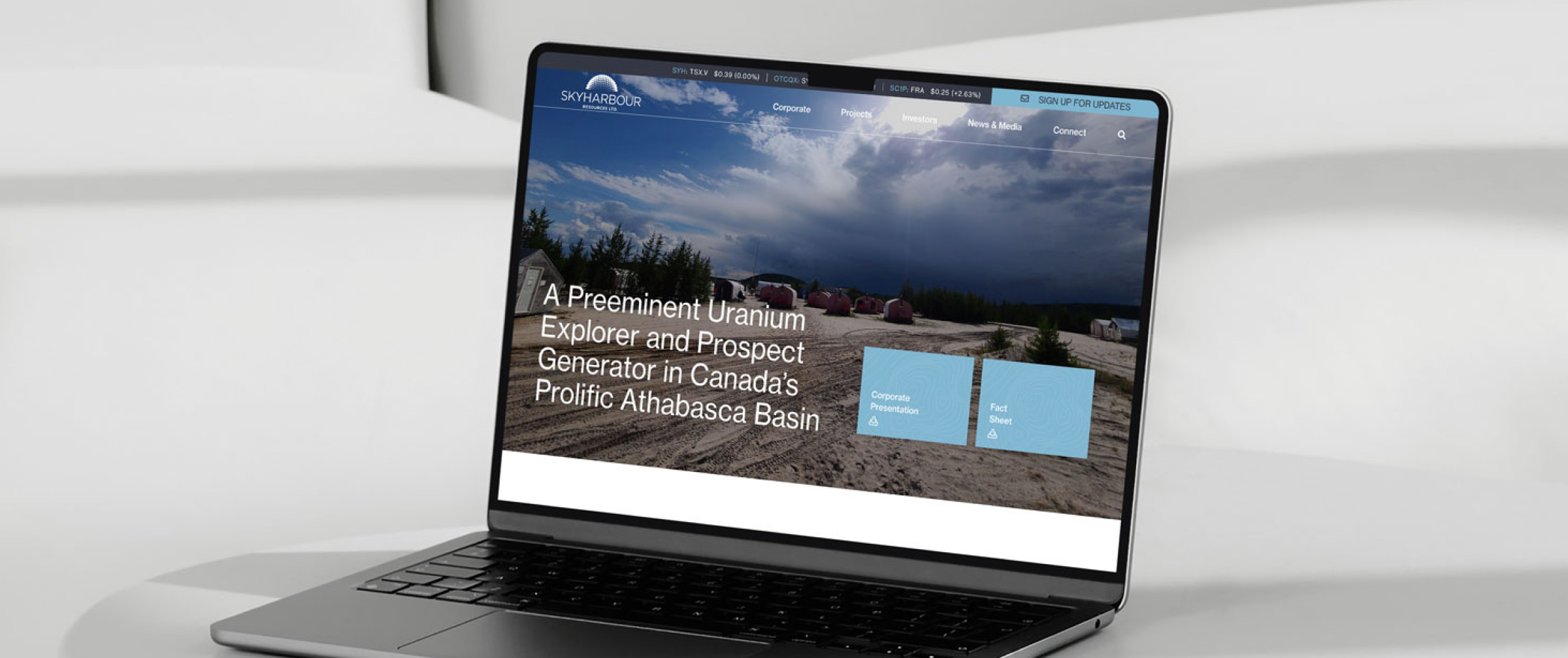
Build trust and effortlessly dispense information about your company with a new website—tailored to any budget.
Learn More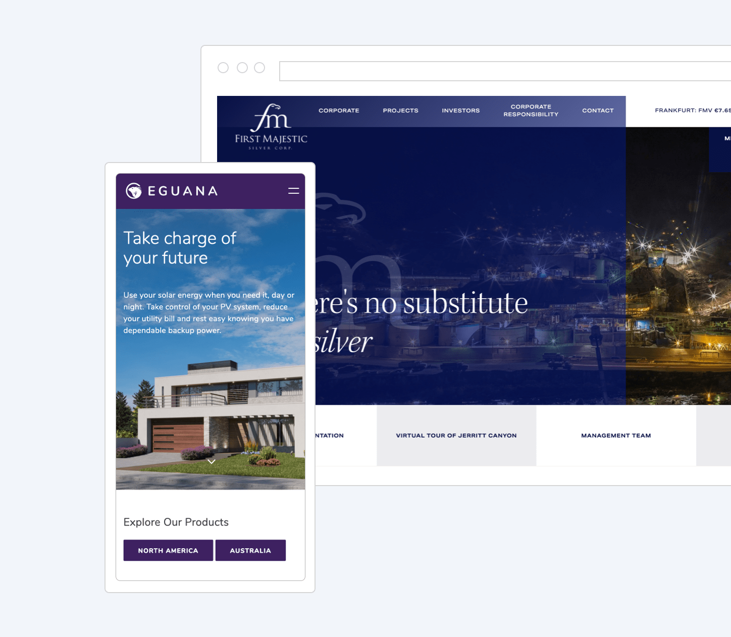
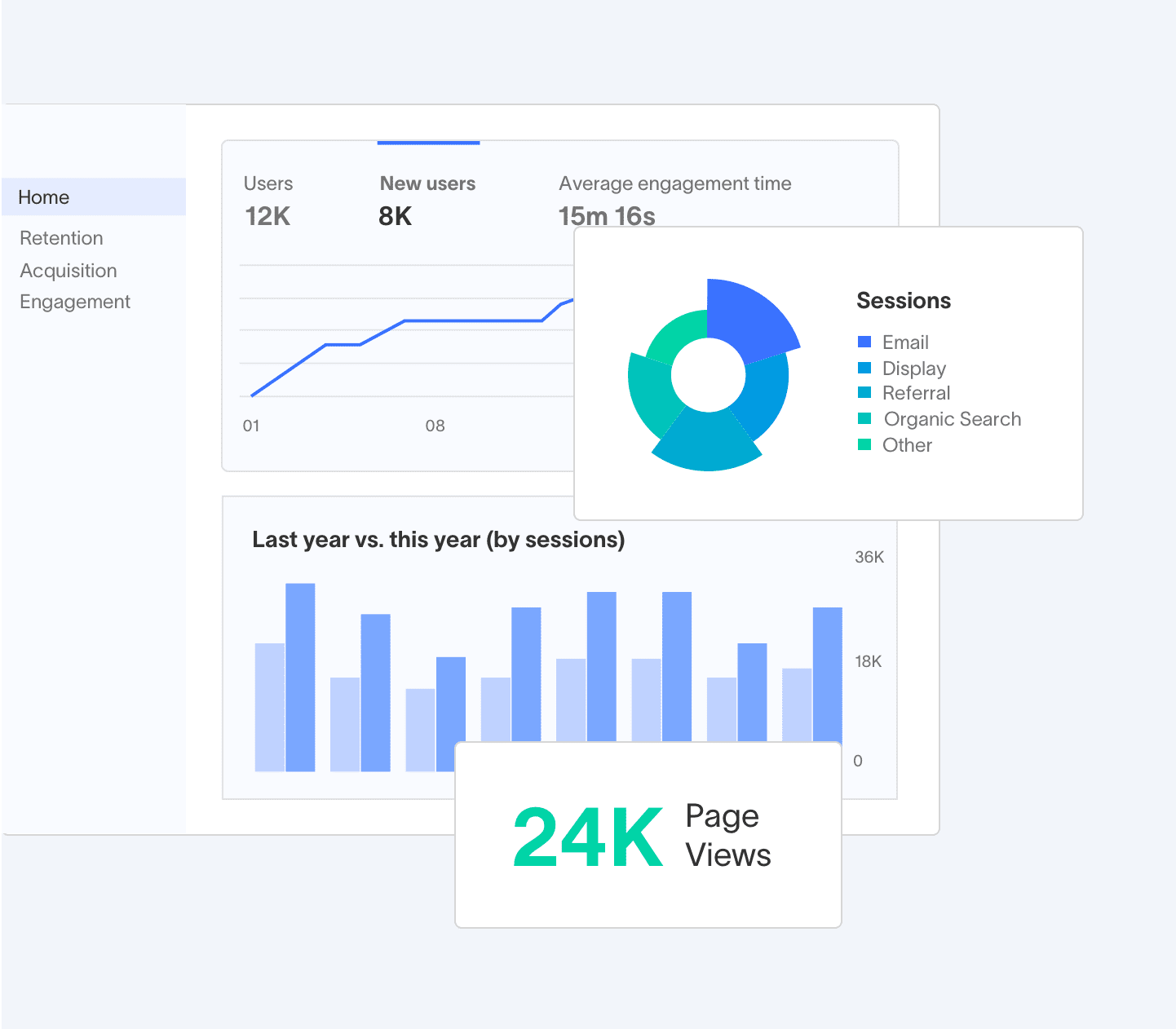
Get more eyeballs on your company and convey your investment proposition with hard data and excellent content.
Learn MoreInvestor decks, print assets, branding and logo development, and whatever else you require to communicate with your audience.
Learn More