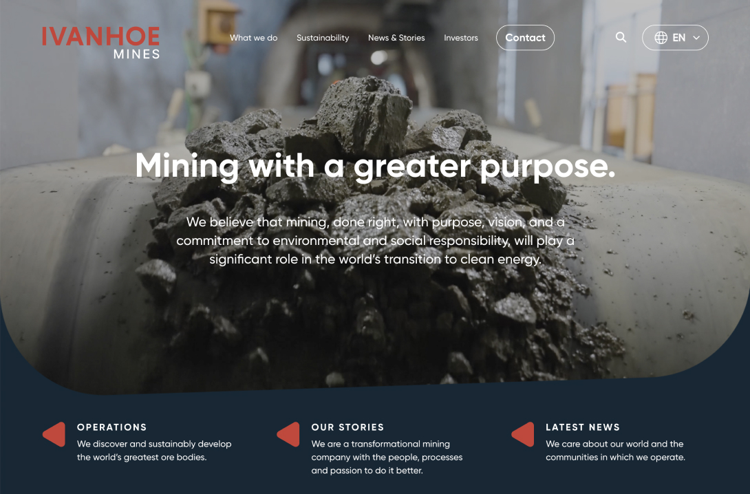
Ivanhoe Mines
Custom Site Mining
Methanex
Custom Site Energy
First Majestic
Custom Site Precious Metals
Taseko
Custom Site Precious Metals
Century Lithium
Custom Site Energy
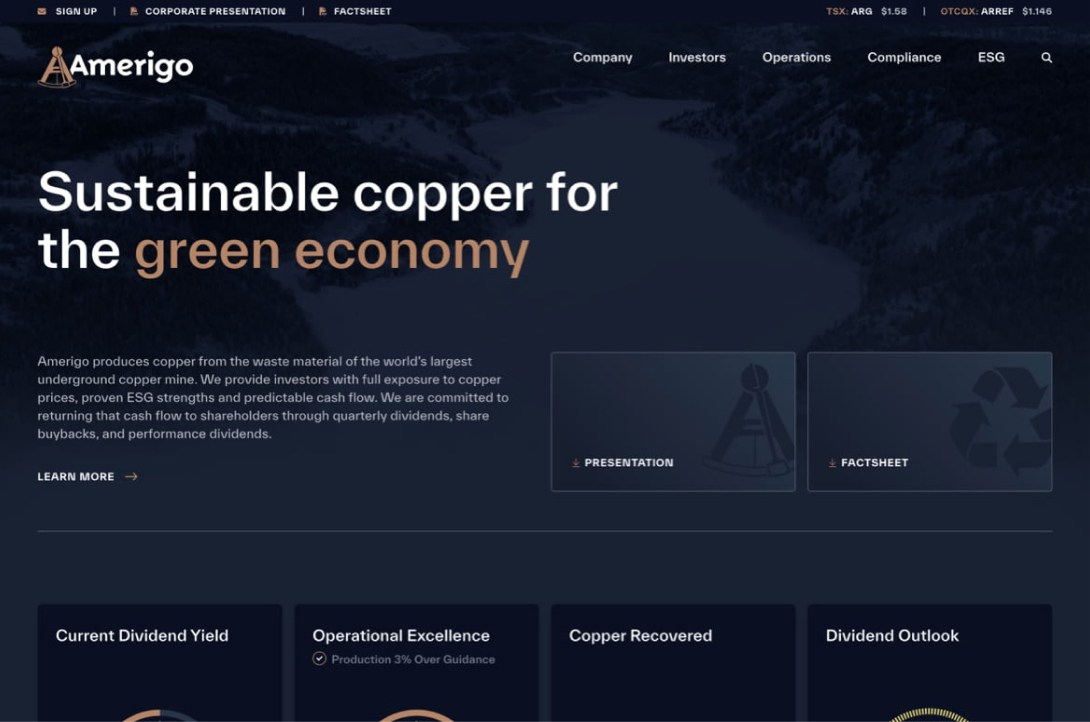
Amerigo Resources
Custom Site Precious Metals
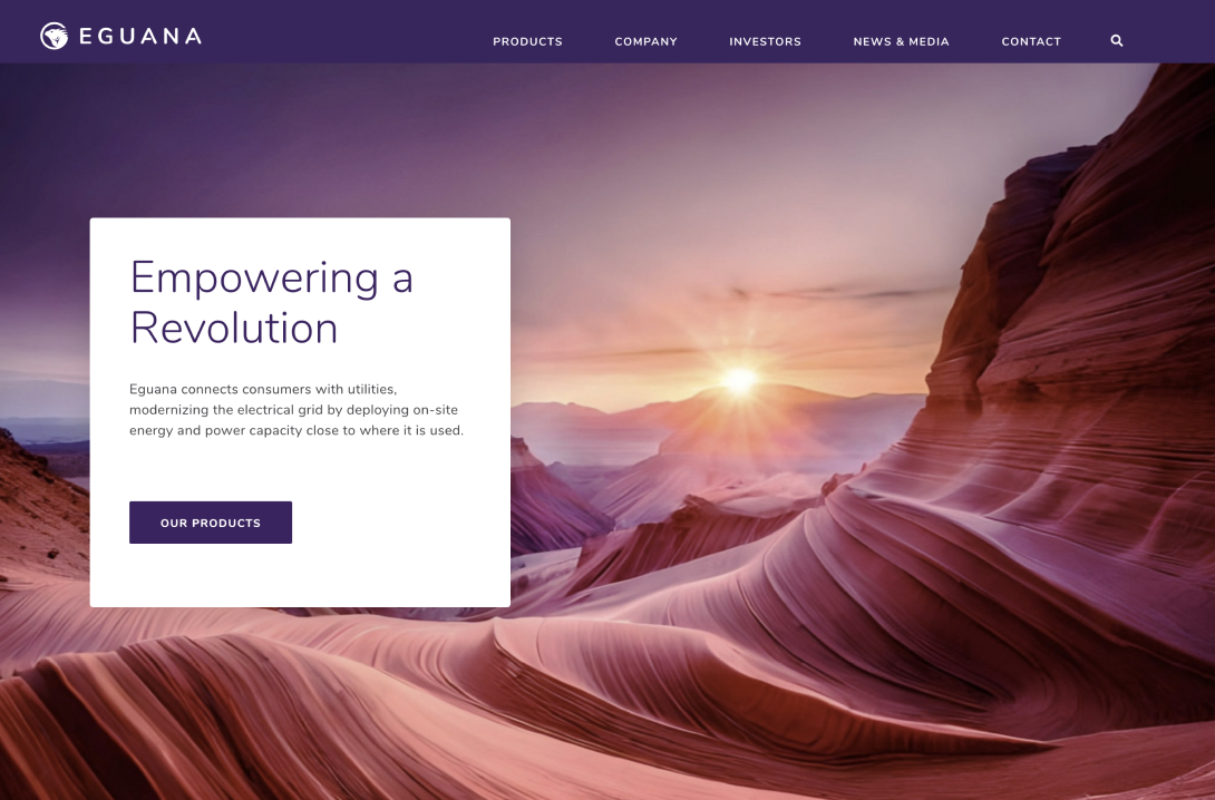
Eguana
Custom Site Technology
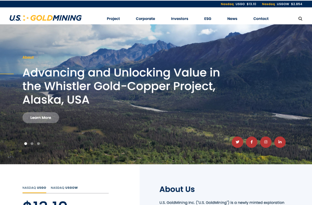
US Goldmining
Template+ Site Precious Metals
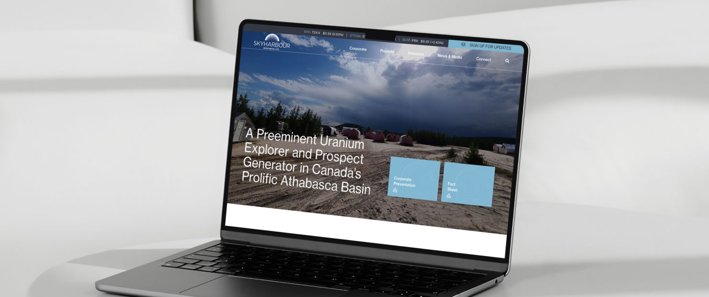
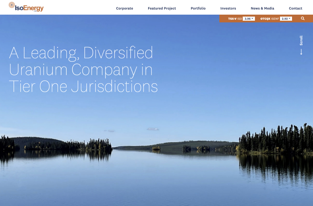
IsoEnergy
Custom Site Energy
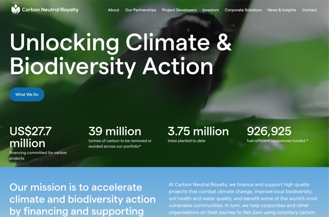
Carbon Neutral
Custom Site Precious Metals
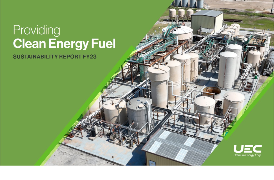
UEC Sustainability
Custom Report Energy